blueprintONE
the revolution
begins here
Super responsive
Super simple
1 column stack
BluePrint ONE
Blueprint ONE is a simple container or 1 column stack but with 3-way responsive breakpoint controlled settings.
BluePrint ONE is based on the familiar Stacks 1 column controls so there is virtually no learning curve. Just enjoy the additional features.
Everything on this page was made using BluePrint ONE. There are no other column stacks, theme or framework features used and it works in any theme.
Simple, Powerful
and Useful Layouts
Simple & intuitive.
There are no complicated setups. Everything works just like a default Stacks 1 column but with more responsive options.
BluePrint ONE overlaps work with any content that you drop into the stack. For text, it is nice if it wraps around the overlapped corner.
Doing this is really easy. Just turn on the Corner Spacer in the stack settings and choose the responsive height and widths. BluePrint ONE does not use complicated positioning, just make two Blueprint ONE columns of different widths and pull one up under the other with a single button click.
Because BluePrint ONE has full responsive controls, it is easy to set the content back to normal full width behavior for small screens. Check out these panels as you resize the browser. You don't need to know about complex percentage relationships, just set it up as you would do with any other simple stack.
Familiar
easy to use controls
Fun & flexible.
A great way to make responsive standout captions and descriptions for your images.
Backgrounds, overlays
shadows and borders,
anywhere.
Modular style
BluePrint accepts all the ProStyles background child stacks.
Any background you like is just a click away without complicating the main stack settings.
Images
Warehouse Images
CMS Images
Blog Images
Colors
Gradients, 2 and 3 way, linear, radial and circular.
Blendmodes
Naturally Responsive,
3-way breakpoint control.
This page was made entirely with the BluePrint ONE stack for layout. No other columns stacks were used.
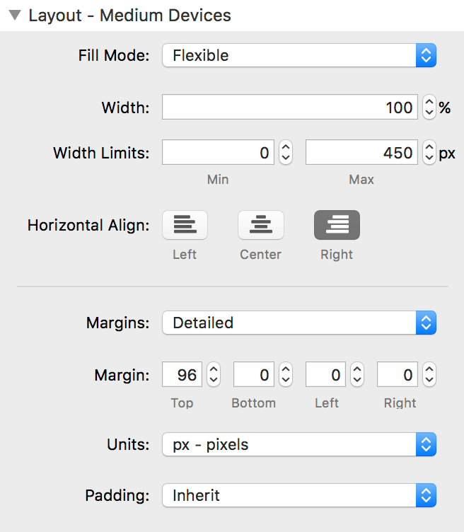
Because BluePrint ONE has very simple responsive controls for 3 different screens widths it is easy to control the position and size of the content.
Resize the browser and see how we can move, re-align or separate the overlaid content with only width and alignment controls.
Just like the basic Stacks column
By making the controls almost identical to the built in Stacks 1 column the is no learning curve.
BluePrint ONE just gives you three sets of breakpoint controlled settings.
Any of the settings can be used or simply set to inherit from the smaller settings. Just use what you need.
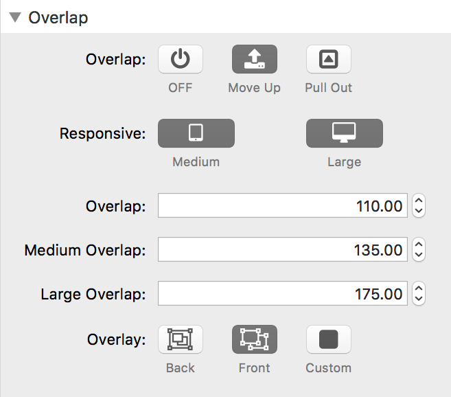
Making Overlaps is this simple.
Most people know by now that this is possible using SectionsPro. Blueprint ONE makes it so simple though. One button click and set the overlap you want and it just works.
Equal Heights
Blueprint ONE can be equalised using the Foundation Equalizer or in any theme using the Match Height stack (from Joe Workman).
Need equal height 3 color circular gradients? What about equal height CMS gallery images as backgrounds? All are simple to achieve using ProStyles backgrounds with BluePrint ONE.
Get Social with
Big White Duck
BigWhiteDuck