Flex Height
Proportional to Width
New in Sections Pro is a new Flex Height mode that scales the height of a Section proportional to the width of the browser or device.
At first this seems counter intuitive but it is really very similar to the way that many conventional elements scale. Images for example exhibit this behaviour by default. So what use would a container be that scales in this way?
In reality much of Sections code has already scaled in this manner since the very first version 1 release. This is the magic behind angles and connectors. Have you noticed the way that a connector will follow the angle of a Section if you move it left and right? This is probably just taken for granted but it is a non trivial task in a browser when just using CSS.
The magic happens because of the basic proportional relationship between the angle, the width and a man named Pythagorus. You don't need to know any of this to use Sections, that is the joy of its automatic settings. All you need to understand is how we can use width proportionality to construct unique and functional layouts in responsive web pages.
The layout problem to solve
PREFACE:
The following all refers to proportional height elements where content control is necessary. It is very simple to produce a proportional layout such as the following where the only content is background images.
Sections Pro deals with real designs with real content and tackles the issue of content getting cropped or cut off for landscape orientation devices and the like.
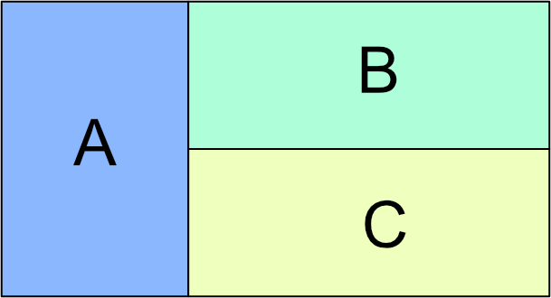
The layout on the right represents a typical user request when using the original Sections stack.
All columns must scale proportionally and columns B and C must always be exactly 50% of column A.
This must happen REGARDLESS OF THE AMOUNT OF CONTENT in each of the columns
Resize your browser with and watch the column content. When the content is about to overflow and crop, Sections Content Control will activate and revert the columns to equalised height with normal padding.
For the purposes of this demo, some CSS has been added to turn the text red just so that you can see when it is happening.
This Section should be equalised and therefore "follow" the height of the right hand column.
In order to vertically center the content, Fixed Height - Vertical Center is enabled in Sections Flex Height Settings
The Sections on this side SHOULD NOT BE Equalized and therefore control the overall height.
Each one is set to 15% win width on desktop and 30% when stacked for mobile.
The Sections on this side should not be equalized and therefore control the overall height.
Each one is set to 15% win width on desktop and 30% when stacked for mobile.
Another Example
The first example showed Sections in a wide 2 column format with gutters removed so that they all flow together with no space.
The process is exactly the same if we want column gutters and can give a very different appearance.
This time, we will make the Proportional content unequal in height, roughly one third and two thirds of the outer column heights.
The Sections on this side should not be equalized and therefore control the overall height.
The Sections on this side should not be equalized and therefore control the overall height.
Content control is active and so they will revert to normal height if and when content overflows.
Resize your browser width and watch how the different content areas go red when content control is activated but the overall layout remains in tact.
The Sections on this side should not be equalized and therefore control the overall height.
More complex layouts like this do take a bit more thought. The main issue is to understand how equalized columns work. Remember that for the Sections background color to span the height of a column, that Section must be equalised.
The examples on this page are just a starting point. There are a lot more uses for the proportional to width setting that you can discover as you get to grips with what can be achieved.