Pin
Stack Settings
Stack Settings
Pin Settings
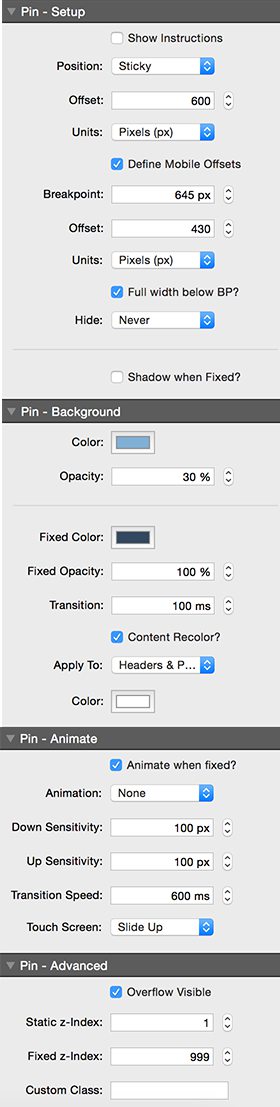
Pin - Setup
- Show Instructions: (checkbox) Show instructions in the stack
- Default: false
- Sticky Preview Helper?: (checkbox) Shows the top and bottom pixel positions of sticky Pin stacks when they become fixed. Useful if you want place one below another as the postiitons will vary according to screen width. Check the values both above and below the responsive breakpoint of your columns. THIS WILL NEVER APPEAR WHEN PUBLISHED, ONLY IN LOCAL PREVIEW.
- Enable: When Position is set to posSticky
- Default: false
- Position: (select) Select how the SlideUp contents are positioned on the page.
- Default: Sticky
- Possible Values:
- Fixed
- Sticky
- Overlay Content: (checkbox) When checked, this will allow Pin to overlay following content. This is useful if you want a transparency element overlaid on top of a header image
- Enable: When Position is set to posFixed
- Default: true
- Offset: (number) The distance down from the top where the the fix will occur
- Default: 0
- Min Value: -2000
- Max Value: 3000
- Units: (select) The measurement units for the fix offset from the top of the browser window
- Default: Pixels (px)
- Possible Values:
- Pixels (px)
- Percent (%)
- Define Mobile Offsets: (checkbox) When enabled, this allows a different offset to be defined below a set breaakpoint. This is important because fixed or sticky content in columns will be positioned differently if those columns are stacked on small screens
- Default: false
- Offset: (number) The distance down from the top where the the fix will occur for small screens
- Enable: When Define Mobile Offsets is set to true
- Default: 0
- Min Value: -9999
- Max Value: 3000
Units: (select) The measurement units for the fix offset from the top of the browser window
- Enable: When Define Mobile Offsets is set to true
- Default: Pixels (px)
- Possible Values:
- Pixels (px)
- Percent (%)
Breakpoint: (number) The breakpoint below which the small screen properties will be applied
- Default: 645px
- Min Value: 0px
- Max Value: 9999px
- Hide: (select) Selectively hide the Pin stack contents dependent on the breakpoint
- Default: Never
- Possible Values:
- Never
- Below Breakpoint
- Above Breakpoint
- Normal Scroll below BP: (checkbox) Do not apply the sitcky fix to this stack when below the breakpoint. It will behave just as a normal stack with this setting enabled.
- Default: false
Full width fix below BP?: (checkbox) Alllows the fixed content to be full browser width when fixed on mobile
- Default: false
Shadow when Fixed?: (checkbox) Adds a shadow to the MagicGallan Bar when it is in the fixed state
- Default: false
- Shadow Opacity: (number) The opacity of the shadow
- Enable: When Shadow when Fixed? is set to true
- Default: 40%
- Min Value: 10%
- Max Value: 99%
- Shadow Blur: (number) The blur radius of the shadow
- Enable: When Shadow when Fixed? is set to true
- Default: 5px
- Min Value: 0px
- Max Value: 20px
- Apply shadow to: (select) If you are using contained elements in a column, you may need to apply the fixed shadow directly to them to avoid overspill of the shadow
- Enable: When Shadow when Fixed? is set to true
- Default: Pin (Default)
- Possible Values:
- Pin (Default)
- Custom Class
- Top Bar
- Magellan / MagicGellan
- Custom Class: (input) Assign the shadow to an element within the pin stack targetted by class name
- Enable: When Shadow when Fixed? is set to true
- Default:
Pin - Background
- Color: (color) The color of the non fixed background
- Default: #ffffff
Opacity: (number) The opacity of the shear background
- Default: 0%
- Min Value: 0%
- Max Value: 100%
Fixed Color: (color) The color of the fixed background
- Default: #333333
- Fixed Opacity: (number) The opacity of the shear background
- Default: 0%
- Min Value: 0%
- Max Value: 100%
- Transition: (number) The transition time of the color and opacity change as the pin stack becomes fixed
- Default: 300ms
- Min Value: 0ms
- Max Value: 2000ms
- Content Recolor?: (checkbox) Apply a different color to text contained in the Pin stack when fixed.
- Default: false
- Apply To: (select) Choose the elements present within the Pin stack whose color you wish to change when fixed.
- Enable: When Content Recolor? is set to true
- Default: Headers & Paragraphs
- Possible Values:
- Headers & Paragraphs
- Paragraphs
- Headers
- All
- Color: (color) The color of the content text when fixed
- Enable: When Content Recolor? is set to true
- Default: #ffffff
Pin - Animate
- Animate when fixed?: (checkbox) Animate the contents on or off the screen when fixed as the page is scrolled up or down
- Default: false
- Animation: (select) Select how the SlideUp contents are positioned on the page.
- Enable: When Animate when fixed? is set to true
- Default: None
- Possible Values:
- None
- Slide
- Swing
- Bounce
- Flip
- Down Sensitivity: (number) The number of pixels scrolled down before the slide up will activate
- Enable: When Animate when fixed? is set to true
- Default: 100px
- Min Value: 1px
- Max Value: 300px
- Up Sensitivity: (number) The number of pixels scrolled up before the slide down will activate
- Enable: When Animate when fixed? is set to true
- Default: 100px
- Min Value: 1px
- Max Value: 600px
- Transition Speed: (number) The speed of the transition as TopBar fixes
- Enable: When Animate when fixed? is set to true
- Default: 600ms
- Min Value: 0ms
- Max Value: 2000ms
- Touch Screen: (select) Select the Transition Effect for Touch Devices (as complex animations will not work)
- Enable: When Animate when fixed? is set to true
- Default: Slide Up
- Possible Values:
- Slide Up
- Bounce
- No Effect
Pin - Advanced
- Overflow Visible: (checkbox) Allow contents to overflow - important if DropDown menus etc are to be used within slideUp
- Default: true
- Static z-Index: (number) The static z-Index controls the layering of the stack when not fixed. Higher z-index values will ensure that is is infront of other components when fixed.
- Default: 1
- Min Value: 0
- Max Value: 9999
- Fixed z-Index: (number) The fixed z-Index controls the layering of the stack when fixed or stuck. Higher z-index values will ensure that is is infront of other components when fixed.
- Default: 999
- Min Value: 0
- Max Value: 9999
- Custom Class: (input) Assign a custom class name to header plus to apply your own CSS styles
- Default:
- Cover: (image) Use a site background cover image.
- Enable: When Animation is set to aniNone
- Default: