FlexiFont
Intelligent Scaling For Text
This first example shows a FlexiFont stack in its default Responsive Mode.
All the normal responsive characteristics are retained, FlexiFont just gives a little help to make sure that the typography remains at the maximum legibility of 45 - 75 characters per line. The minimum allowable font size is set to 12px.
Width:
The Flexifont stack from BWD packages up this functionality in an easy to use form that you can use to rescale individual text elements on your page or the whole page at once.
Notice how the text in this box autoscales to keep the number of characters within range and the height almost constant even on narrow screens. This is Responsive Mode.
Now, by adjusting the base font size for the paragraph text within the stack and adjusting the scale factor, it is possible to fine tune your typographyy for best possible visual appearance whilst still obeying the 45-75 characters per line rule.
It is not necessary to use these settings for FontStyles to work but depending on the distribution of characters in your type, it can make the difference between acceptable and outstanding typography.
Note how we have also now avoided most word wrapping so that the paragraph looks identical at all screen widths
Width:
The Flexifont stack from BWD packages up this functionality in an easy to use form that you can use to rescale individual text elements on your page or the whole page at once.
Notice how the text in this box autoscales to keep the number of characters within range and the height almost constant even on narrow screens. This is Responsive Mode.
FlexiFont has a drop zone into which you can put multiple text elements. Their relative sizes will be respected, so headers will stay larger than paragraph text and so on.
If you are using the base font feature above, this will only be applied to paragraphs, lists and links. Headers will retain their original settings.
This means that you can apply a single scaling rule to a section or group of items.
Width:
FlexiFont
Lets Scale This Section
Static font sizes are great for most cases in responsive websites. In some situations though, you find yourself wishing that your typefaces were a little more adaptive than is achievable with simple 2 or 3 stage media queries
Simple autoscaling based on the width of a container such as a column does not work. In responsive sites columns will not fluidly change width. Instead they may jump to a new width at a breakpoint (such as for small screens) and then max-out once you get to the site width.
....but it doesn't stop there. Flexifont will also allow you to scale every text element on the page without dropping anything into the stack.
If however there are some problem elements you can then put them into their own flexiFont stack and control them individually.
This is the real power of FlexiFont - total control.
In a Screens page for example. Screens autoscale is great but with FlexiFont stacks, you can apply that great intelliScale technology to individual elements rather than treating the whole page as one.
Width Control of Font Size
FlexiFont has breakpoint controlled settings to limit the extents of the scaling. You can specify a minimum and maximum browser width below and above which no further scaling will apply.
You can further more opt to switch of scaling completely at the minimum breakpoint and allow your normal site font-size settings to be resumed.
Adaptive Breakpoints
There comes a time where no amount of scaling will do the job. Text just becomes too small to be of use. At this point media query control of content is required, colloquially know as visibility stacks.
FlexiFont takes this concept to the next level and is able to hide content dependent on both browser height and also browser aspect ratio. This is particularly important when you are using FlexiFont with Screens or other single page limited height designs. The image of the stack settings below is set to hide at browser aspect ratios below 8:5, try resizing your browser to see it in action.
FlexiFont is super flexible and super powerful.
It is however also extremely easy to use. For most situations, the out of the box settings are just fine. All you will need to do is adjust the scaling factor to your preference.
Advanced users, and those that are pedantic about presentation, will find every conceivable setting is possible.
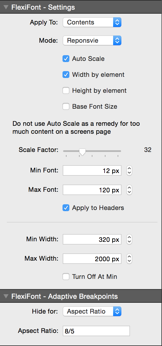
The image above will be hidden at browser aspect ratio's greater than 8:5 (i.e. more landscape)