Sections Stack

Sections
Overlay Examples
About Overlaying
Sections is a very flexible and easy to use stack. It does also allow you to achieve some quite complex effects.
The key to understanding how overlaying works lies in the understanding of simple margins and padding. You can alter the height of a section by applying padding inside it. You can alter the vertical offset of a section by changing its to margin (including to a negative value in order to shift it up over the section above)
You can also apply negative bottom margins if you wish in order to allow content below to overlap the bottom of a section.
Remember that the section background that you and its content can be moved independently. Using the Background Top: setting in Sections - Settings you can move the content (i.e. stacks that you have put in the drop zone) up and down relative to the section background.
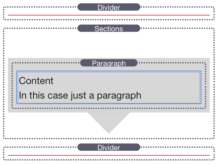
The Structure of a Section
In a simplified form a section consists of the wrapper on which the background resides and its content which contains any stacks you drop into it.
In order to see where the stacks content is in relation to the sections background, the content is surrounded by a blue border. This content comprises any stacks that you drop into the Sections stack drop zone
This is the basic layout of all the stacks below as setup in edit mode.
There is a red divider above and below each sections stack.
The dividers have a margin of zero set and are indicative of the bounds of any stacks placed above and below the sections stacks in your layout.
The Basics
Content
In this case just a paragraph
Here we have a section in its default state. Auto top and bottom margins are enabled and so there is a gap above the stack. The auto margins account for the space required by a connector and also provide a normal spacing with the stack above it if the section is angled.
The content is contained within the background.
Content
In this case just a paragraph
Now if we turn off the auto top margin the main stack body butts directly up to the stacks above and below it (the red dividers)
The arrows however are outside the stack boundary with Auto margins turned off. - This is how we make the arrows overlap adjacent sections
The content is contained within the background of the main stack body.
Automatic Padding
Content
In this case just a paragraph
Here we can see the Automatic Padding.
Sections has advanced automatic padding so that the content is contained within the background even when you apply an angle to the background.
The only change in the stack settings was the angle. The padding settings are left in Auto mode.
Sections has automatically padded the height of the background to ensure that our content is fully contained within it.
Top and bottom margins are set to Auto - so the stack automatically makes enough space for itself to stop the angled background overlapping the stacks above and below
Content
In this case just a paragraph
Now with automatic padding switched off.
The angle of the section will overlap the stacks above and below.
With an isolated section this is undesirable but when we are trying to place two angles sections together with no gap in between, this is exactly what we want.
This is demonstrated in the two pairs of sections below
Top & Bottom Margins.
Auto and Manual
Bottom Margin: Auto
Top Margin: Auto
Bottom Margin: None
Top Margin: None
Bottom Margin: Auto
Priority: 2
Top Margin: Auto
Priority: 1
Bottom Margin: None
Priority: 2
Top Margin: None
Priority: 1
In order to provide a nice spacing in the section, don't forget to add some Padding. This will prevent overlapping arrows colliding with your content.
This can either be done using the Sections - Padding settings in the Sections stack or by applying padding to your content.
Note: Because sections works proportionally, it is advisable to add top and bottom padding proportionally. So if you are adding padding to stacks that you drop in the use a Grummage 1Col, Grummage Plus or a Vertigrum to add proportional padding
Content Padding 5%
Content Padding 5%
More Advanced
Background Position Control
The Background Top control allows you to offset the background from the position of the sections stack.
Because we are only moving the background and not the stack contents then all the margin controls work normally.
Please use with caution though. Unless you understand margins and element positioning you can make a mess of your layouts.
Content
In this case just a paragraph
This Section is exactly the same as the very first example in The Basics above except that the Background Top setting has been set to +6%
Note how the background has been shifted down relative to the content. You can see this by referencing the position of the blue outlined content to the red lines of the stacks above and below the sections stack.
Remember: without other padding and/or margins on the stacks below the Sections Stack, its background will overlap. This allows you to create some great effects but be careful not to make a mess of your layouts.
Content
In this case just a paragraph
Similarly, this Sections Stack has the Background Top setting set to +6%
Sections
Overlay Examples
The Effect at the top of this page uses two sections stacks. The Bottom one of which has its background shifted down in order to let the word "Sections" show above the background
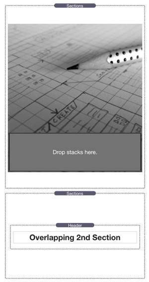
Overlapping Entire Sections
Overlapping 2nd Section
Instead of just overlapping the background we can overlap two entire sections.
Here, the top section contains the background image.
The bottom section is angled with an opacity background.
In this case we want to overlap the whole section so that both the text and the background overlay the image above.
This is achieved by setting a manual negative margin to the second sections stack.
Here are the stacks in edit mode the were used to create the above section
Sections is fully proportional. We can therefore duplicate the above sections, take them out of the 2 columns and allow them to go full width without any changes to the stack settings as you can see below
Overlapping 2nd Section
Just remember that following content (i.e. this paragraph) will need padding down proportionally as well. The top of this stack without padding will be right below the "Overlapping 2nd Section" stack above.
So all we need to do is to put following stacks inside a GrummagePlus and apply a proportional top padding to ensure that we clear the bottom of the image. Because sections is using proportional padding, it is important that we space the following content with proportional padding as well so that everything stays in place at all screen sizes.
Sections is not necessarily designed for purely overlaying images and there are other stacks that can do this.
If however you want angles and ultimate content control then sections is more than capable.
Here are another couple of examples.....
Overlay Image on Image
Overlay Image on Image
Stacks used on this page
Foundation Theme & stacks
Sections
Grummage Column Stacks
Header Plus
MagicGellan
Big White Duck
Free Stacks for Foundation and other RapidWeaver Themes
- Sitemap
Community Links
Newsletter
Sign up below to receive updates on new products and offers first.