POPDROP
Stack Setup
Find out how the settings influence the appearance
and behavior of your PopDrops.

THE STACKS


INTRODUCTION
To use PopDrop all you need to do is add your content, set the link and it works. PopDrop is really easy to use.
When you drop a PopDrop stack onto your page you will see that it comprises of two stack components.
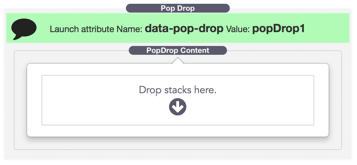
The main (outer) stack, labelled "PopDrop" is the Main PopDrop Stack. It controls the launch ID and a few stack wide settings.
The inner stack is the PopDrop Content and contains the setup and styling for the actual popover / tooltip or dropdown that will appear on your page.
Why in 2 parts?
PopDrop Content is a child stack. You can therefore copy/paste or copy-drag content stacks between your PopDrop instances.
Tip: This is a huge time saver as you don't need to laboriously replicate your custom style settings. Just copy it across and then drop in some different content.
PopDrop Content can be added to a ButtonPlus 2 stack without using the parent PopDrop stack. This allows for zero setup linking of the button to the content. You don't need to set anything up to make it work other than drop in some content for your PopDrop
 MAIN SETTINGS
Collapse In Edit Mode
Simply allows all your content to be hidden in edit mode just leaving the PopDrop name and link information.
Lauch ID
This is the most important setting in any PopDrop. It is the unique ID that you use to tell a link to open this PopDrop.
Launch ID's should be only alphanumeric characters. Keep them simple and descriptive.
Allow Multiple Triggers
In the unlikely event that you want to launch the same PopDrop from more than one link then you should enable this setting.
As the note describes, you cannot use nested PopDrops when this setting is enabled.
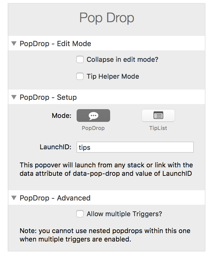
Tip Helper Mode
Selecting this option will float your list of ToolTips at the top of your edit mode screen. This is great for setting up the links and tooltip content for a page as you don't need to continually scroll up and down between your links and the PopDrop stack.

TipList Helper
Click for more information
Tip Helper Mode
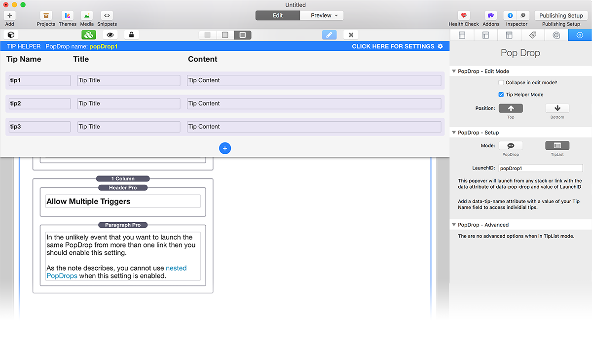
The Tip List is floated in the edit mode window at either the top or bottom.
You can quickly add Tips, check the Tip Names and alter content while the links that they refer to are in view. No scrolling up and down is required.
Learn more about using TipLists
 CONTENT SETTINGS
Basic Setup
Collapse In Edit Mode
Hide your content in edit mode to save space.
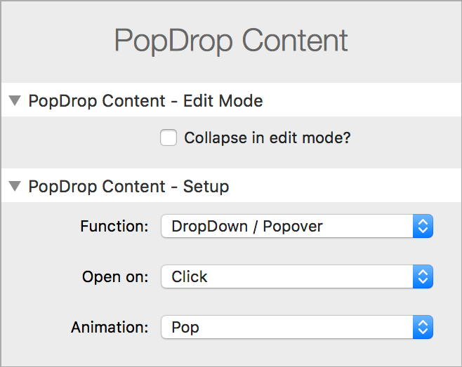
Function
Choose to display as either a DropDown / Popover or a Modal dialog.
Open On
The PopDrop can be shown by either clicking or hovering on the link. On touch screens click will always be used.
Animation
You can either use a Pop, a Fade, or no animation when the PopDrop appears.
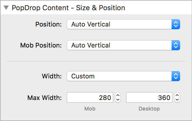
Positioning
PopDrops can appear in various positions relative to the link that triggers them.
The Auto settings are most useful and will ensure that the PopDrop appears within the viewable area of the screen.
You can force the PopDrop to appear Above or Below by not using the Auto settings.
Custom Width
With simple content you do not need to set a width. PopDrops will automatically size themselves to the content.
If, however you add content with columns or other layout elements it is necessary to adjust the maximum allowed width to prevent them from appearing full width.
The default max-width works well for most such situations.
Contained Width
This will contain the width of the PopDrop to the same width as the element that it is launched from.
This is particularly useful if you want to make a dropdown menu that is launched from a button.
Mega Width
Mega width PopDrops will take up the full width of the browser and allow you to make mega menus.
You can also apply a max-width if you want your mega dropdowns to be contained to the width of your site content for wide screens.
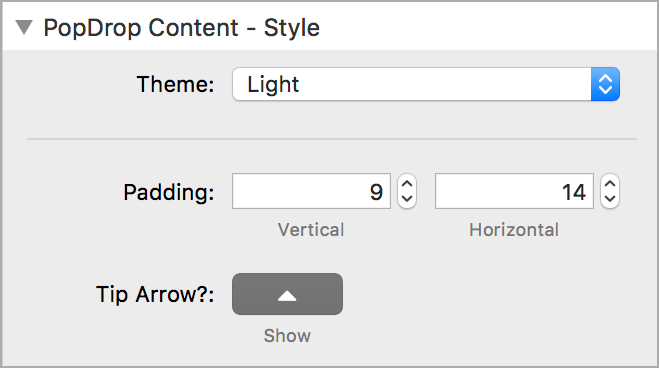
Styles
You can choose from 10 ready made themes for your PopDrops or use a Custom Style.
Themes will also automatically color your content text where possible. The dark theme will make text a light color and vice versa. You can override this behavior by simply setting a color on your text as normal.
Custom Styles allow you to set up every aspect of the PopDrop to your liking.
Padding
Pad the content area of the PopDrop to give a little space around its edges and improve the appearance.
Tip Arrow
You can turn off the Tip Arrow if required. This is useful when making dropdown menus.
Modal dialogs will always remove the Tip Arrow automatically.
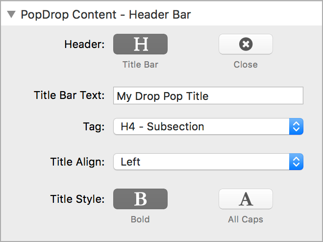
Header Bar
Optionally display a header bar inside your PopDrop with a title in it.
Close
When selected, the PopDrop will display a close button in the top right hand corner.
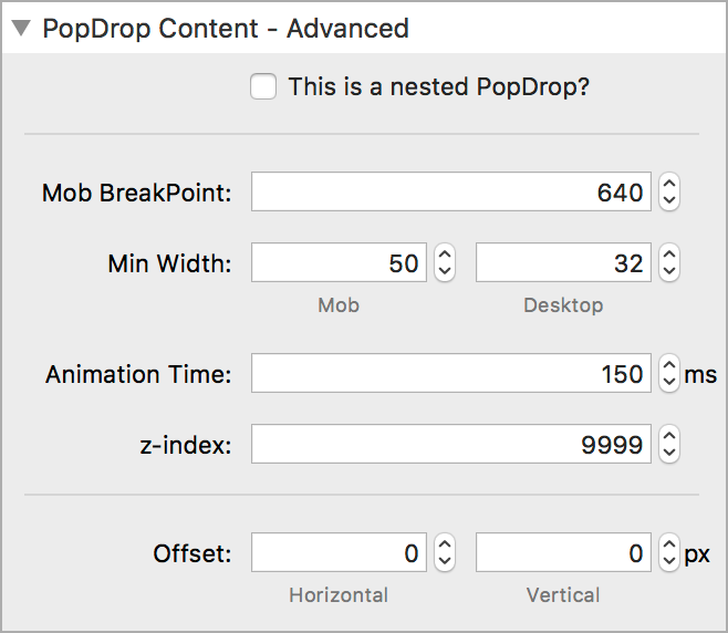
Advanced
These are the settings that you don't normally need to touch but are there for those who like to tweak things.
Nested PopDrops
If you are building a multi-level PopDrop dropdown menu then you should enable this feature.
When selected, the PopDrop will not close its parent PopDrop when opened. Closing the parent will close all its nested child PopDrops.
You can close all open PopDrops from any element (even a link within a PopDrop by using these custom classes or data attributes.
An example where this may be useful is when using a form cancel button within a PopDrop
Classes
close-popdrop
close-popdrops
Attribute
data-popdrop-close
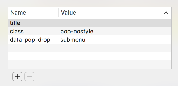
Prevent PopDrop Link Styles being applied to a link using this class.
This is sometimes necessary if you have a link to a submenu that opens another PopDrop.
Class
popdrop-nostyle
 LINK STYLES STACK
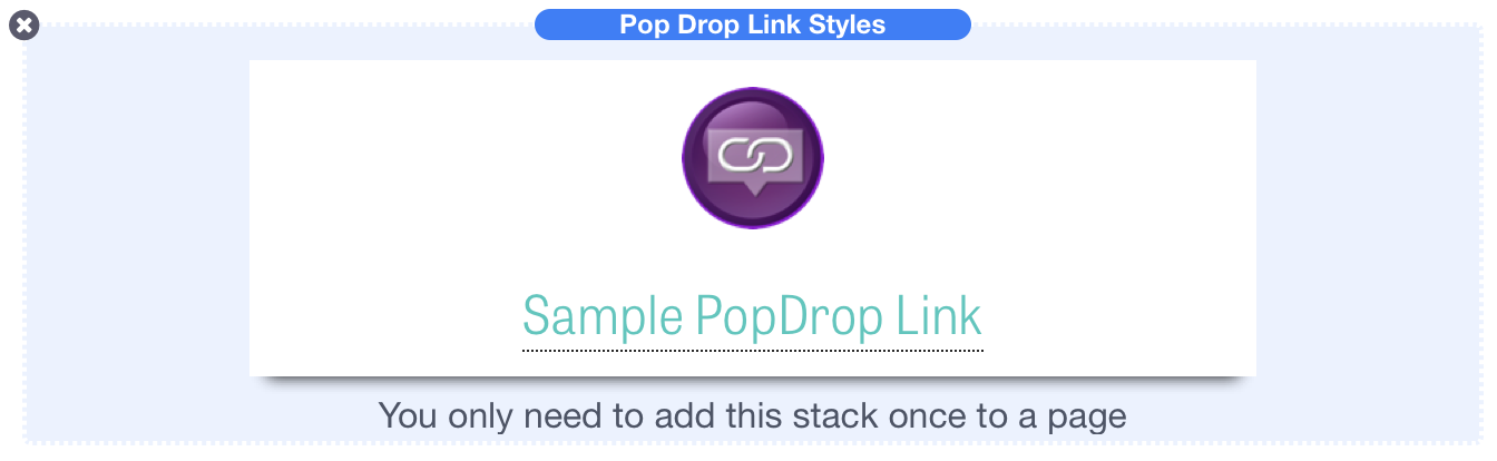
Introduction
PopDrops are triggered from links, just the same as links to other pages or sites.
To help users distinguish between tooltips and normal links, you can use the Pop Drop Link Styles stack to give a different look to PopDrop links.
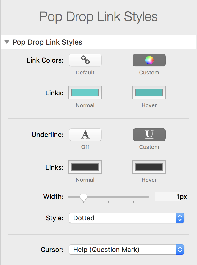
Settings
You can choose to apply custom styles to the colors, the link underline and the cursor shown when the PopDrop links are hovered.
By way of example, this is a normal page link and is shown in the pink color chosen for this site.
Here is a PopDrop Link which has been styled using the Link Styles stack on this page with the settings as shown. when this setting is enabled.
Excluding Links
If you need to exclude a particular pop drop link from being affected by the Link Styles just give is a class of pop-nostyle in the link dialog.
POPDROP
PopDrop is another free stack from Big White Duck. It works in any theme but also has a special integration for the ButtonPlus 2 stack when used in Foundation.


 POPDROP
Big White Duck. Stacks for RapidWeaver.