


ButtonPLUS2
RESPONSIVE SIZING
Controlling text and icons
BP2 ResponsiveEASE OF USE

Basic sizing for simplicity, advanced responsive for power
ButtonPlus is just like any other Foundation button and can use the built in sizing classes such as tiny, small, large etc.
Where it differs is in its ability to use 2 or 4 way responsive sizing, just as found in HeaderPro and Paragraph Pro.
BP2 ResponsiveRESPONSIVE CONTROL
A button is just a link, with a background
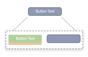
OK, that is a slight oversimplification but in essence is true. A link with some padding and a background will make our button.
Most buttons are "take what you are given" which is great for most circumstances. But what if you want control of the padding, the font size and the dimensions, well with ButtonPLUS 2 you do.
This becomes particularly important with icon only buttons and special use case buttons, such as those used in menus.
Don't forget that buttons by default have a bottom margin (orange). Check the setting to remove this if you find unwanted vertical spacing.
Reponsive Sizing Controls Tutorial
How to make great looking icon buttons
RelatedMENU INTEGRATIONS
Unleash the power of ButtonBar menus
The menu on this site is just one example of a ButtonBar menu using BP2 drop downs. With Button Bar and ButtonPlus 2 you can literally make any menu that you can design.
