All about Chroma
Chroma is flexible and modular making it easy to create many different layouts and effects. Go beyond a simple sticky menus and make slide in social bars or secondary page headers.
Features
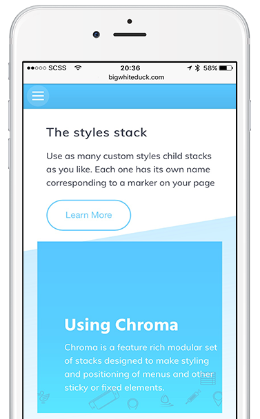
Chroma is a feature rich modular set of stacks designed to make styling and positioning of menus and other sticky or fixed elements.


Chroma Pro
Sticky and fixed positioning.
Top or bottom fix.
Side fix for icons or menu toggles.
Sticky & Fix Triggers
Unlimited Marker Style Triggers
Unlimited Style Definitions
Scroll Controlled SlideUp function.
Marker Controlled SlideUp function.
Scroll Controlled Head Slide function.
Marker Controlled Head Slide function.


Chroma
Sticky and fixed positioning.
Top or bottom fix.
Side fix for icons or menu toggles.
Sticky & Fix Triggers
Single Marker Style Trigger
Two-state Style Definitions
Scroll Controlled SlideUp function.
Scroll Controlled Head Slide function.


Chroma Marker
Works with Chroma and Chroma Pro
Multiple Chroma sharing
Responsive Offset Controls
In Detail
Fixed and Sticky Positioning

In Detail
FIXED POSITION
Fixed Menus
Fixed position menu bars are difficult to style nicely when your pages contain a hero or large header.
This is particularly troublesome with images. You don't want to have a menu bar background over your beautiful header but if it is transparent then the menu looks terrible as the rest of the page scrolls under it.
Chroma allows you to change not only the background colours but also the text and title colors as you scroll down the page. All the transitions are smooth and co-ordinated.
Transition on markers
The key difference between Chroma and other solutions is that Chroma can use markers on your page.
This is important because transitions can be precisely controlled to happen exactly when you need them. Using percentages means variations with different browser sizes as the content length changes.
Chroma Pro allows you to define unlimited marker triggered styles. You can have multiple Chroma controlled elements on the page as well. Perhaps a slide in social contact footer as well as the main menu. Markers can be shared between Chroma stacks or they can each use their own.
Fix anywhere
Chroma allows you to fix items at the top, bottom or the sides of your browser. All of these positions can be configured with responsive offsets
Both top and bottom positioned Chroma contents can be hidden or shown by sliding in and out of view on demand. This can be controlled by scrolling up and down (like the iOS Safari navigation controls) or directly using markers.
Chroma bottom fixed elements work perfectly with mobile browsers even when their navigation bars slide in and out. Chroma elements slide seamlessly with the browser bars automatically.
In Detail
STICKY MODE
What is sticky compared to fixed?
Sticky elements should be placed some way down your page. When they reach the top of the browser they will smoothly tick to the top with no jump of your page content.
If your menu or other Chroma content starts at the top of the browser then use the FIXED position setting. By using sticky you achieve nothing other than using more of the browsers processing power for no reason.
There is often confusion between the meaning of sticky and fixed. If something is sticky, it infers that it is capable of sticking to something but not that it is permanently "stuck".
If something is fixed then it infers that it is pinned or fixed to a certain position always.
Actions upon sticking
Chroma allows you to perform style changes as it becomes fixed from the sticky static state. This may be a simple color change or the addition of a shadow or it may be size or padding changes or even the animation of the site logo image.
See the examples micro-site for lots of ideas of what you can do with chroma and also several of the BWD sites including the main site and the ButtonPlus2 demo site, both of which use Chroma.
In Detail
Slide Away Content

In Detail
SLIDE AWAY HEADERS & FOOTERS
Introduction
Image that you would like an information bar above your menu. This may contain a search area, social icons or other contact information.
This looks great but it takes up screen real estate. Using the Slide Away Header function, Chroma can gracefully show and hide this area whenever you want.
The difference between Slide Away and Slide Up/Down
SlideUp and SlideDown hides your entire menu as the user scrolls or as markers trigger the action.
Slide Away JUST hides the extra content above( or below if bottom fixed) your menu, leaving your navigation still visible.
Scroll Controlled.
In this mode, the slide away area can be hidden as you scroll down the page and can re-show as you scroll back up a little. This is very much like the way that iOS Safari navigation bars work. Slide away content of course works seamlessly on touch devices, moving with the browser navigation bars.
Marker Controlled.
Slide away content can of course also be controlled on demand using Chroma markers.
This allows you to show and hide special messages where ever you want as the user scrolls down you page.
In Detail
Markers & Styles

In Detail
MARKERS
Introduction
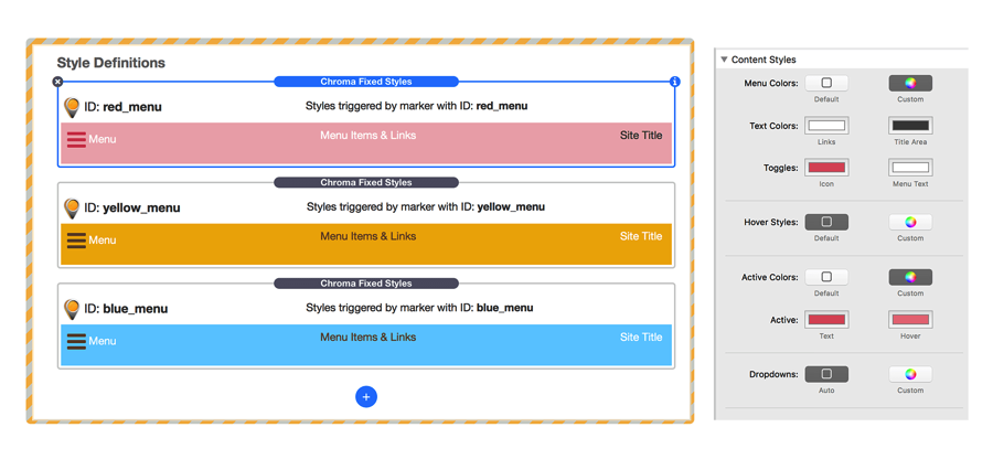
Chroma markers can be placed anywhere on your page. They are totally invisible elements that simply tell the Chroma stack when to change its styling.
Each marker is linked to a style by its marker ID that you define. By giving markers memorable names, remembering which style is being applied and when, is simplified.
Just use alpha numeric characters and underscores for marker names. Do not use spaces or odd characters.

Markers are easy to spot in edit mode, matching the styling of the Style Definition area of the main Chroma stack.
The marker name is clearly visible in the page without needing to refer to the stack settings.
Offsets.
Sometimes it is impossible to drop the marker stack exactly where you need it, for example part way down an image.
Markers therefore have a responsive offset control so that you can specify how many pixels, before or after the marker, that the style is triggered,
Automatically Responsive.
Previously, markers for stacks such as MagicGellan have required that you specify separate offsets for desktop and mobile. This was to account for the potential difference in menu bar heights.
Chroma improves this by simply letting you specify that marker triggers should be relative to the bottom of the Chroma stack rather than the top of the page.
In this way, it doesn't matter what height your menu is, Chroma will always trigger the style change at just the right point.
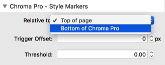
This also avoids potentially unsightly delays in style changes when the menu is floating over images and headers.
In Detail
STYLE DEFINITIONS
Defining Styles
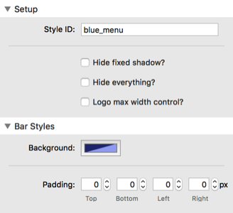
Chroma styles are added by simply clicking the blue "add child" + button in the Chroma stack.
Each style that you define is a complete set of customizations for the menu or Chroma content that will be applied when its corresponding marker is reached on the page.
Style Chroma
Each style definition gives you complete control of the Chroma stack.
Of course the background color and padding can be altered but also shadows can be added and removed but also site logos can be smoothly animated to a new size.
You can even fade out and hide the entire Chroma controlled bar, ideal for use hero headers and images without the need to use a sticky menu.
All this is done with simple CSS styling and so is silky smooth. The chromascroll javascript just efficiently adds and removes the appropriate classes as makers are reached on the page.
Style menu items.
You can choose which elements of standard menu stacks that you want to override with Chroma Styles, including things like links, site titles, mobile burgers and more.
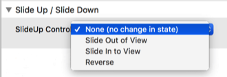
Control Slide Up and Slide Down states.
Each marker can optionally tell Chroma to either slide in to view, out of view or to reverse its current state
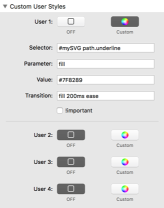
Custom Selectors
For advanced users, there is also the option to use custom selectors to apply chroma styles.
This allows you to style just about anything that you like.
About Chroma
Chroma has been in use for over 2 years on various sites under the name of ScrollUp Pro.
As the features and capabilities expanded, it was decided to rename it to reflect how different it is from the original ScrollUp stack.
Simple yet powerful
Because both Chroma and Chroma Pro can use markers on your page to trigger style changes, and other properties it is super easy to use.
No more percentage guesswork, Chroma makes all this easy and precise. Less compromises, more polish and professionalism.
FREE STACKS FOR RAPIDWEAVER