
This is ScrollUp Pro

ScrollUp Pro
Bring your menus and headers to life.
Scroll marker activated style changes for fixed and sticky headers.
Color and slide away your menus for different parts of your page.
Works with menus and just about any other content that you drop into it.
The main stack
ScrollUp and SlideUp are all now combined into ScrollUp Pro.
You can specify unlimited color and style changes using ScrollUp Marker stacks.
Just place a marker where ever you want a transition to occur.
You can fix and slide at the bottom, like the social icon links on this page.
(Scroll back up a little and what the bottom of the browser).
You can also use a contained with for use with menu toggles and buttons.
Simplicity with child styles
Instead of a ton of stack settings, everything is now modular thanks to Stacks3.
The main stack controls the initial colors, padding, transitions etc.
Child stacks are added to style the fixed states. Each child stack allows you to style background and foreground colors, contained menu style (including Facet, TopBar and MagicGellan).
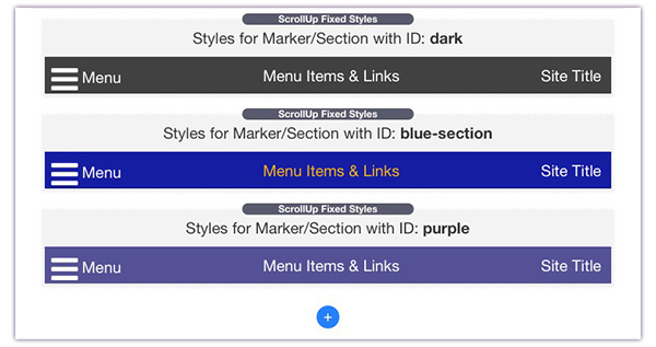
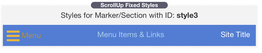
Give each of the fixed styles an ID.
Place a marker on your page where you want that style to be applied.
The ScrollUp Marker

Simply add as many Markers as you want to various points on your page.
Give the marker the same ID as the ScrollUp Pro fixed style that you have defined in the main stack. Hey Presto - color changes to your menu whenever and wherever you want them on the page.
No more guessing percentages. Markers can trigger relative to the top of the page, or to the bottom of the ScrollUp stack.
Just like MagicMarkers, ScrollUp Markers can each have an offset defined in their settings - allowing fine tuning of the trigger position.
Markers can also have their drop zone activated so that you can add your section content to the marker, keeping the page organised and easy to re-arrange.
Sections will have built in support for ScrollUp Pro Makers in the next update too so you can directly trigger from a section.
Styling Features
TopBar Control
The re-coloring of TopBar menus has been simplified, made semi automatic and gives you a lot more control
DropDown Color Control
Auto
In auto mode, the TopBar DropDowns will follow the color set for the ScrollUp background in any Styled section.
Custom
The traditional use for custom styled dropdowns is when the TopBar is set to transparent. This is not needed now as the Auto setting handles this.
Where custom does become useful though is when the ScrollUp background is also transparent - like at the top of this page.
Style menu text, and icons
You can alter the colors of the menu links, the site title and even the mobile hamburger to suit the background color you are using.
Menu Content Color Control
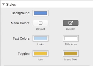
Not only can you re-style the menu items (links) and the title area but you can also color the mobile icon and associated text.
These settings work for Facet, TopBar and MagicGellan menus
Facet Only Settings
As well as styling the Facet menu colors when closed, you can additionally specify colors to use when it is open.
This is important if your Facet panel is of a different contrast to the page.
Edit Mode Helper
ScrollUp Pro provides a handy edit mode representation of a menu so that you can easily see the colors applied.
Slide Up Features
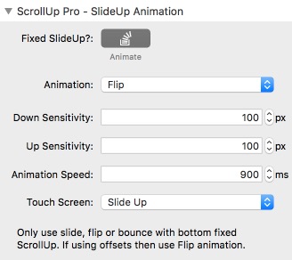
SlideUp Animations
ScrollUp Pro now includes all the features of the SlideUp stack but with new animations and the ability to slide up and down form either the top or the bottom.
We also now have an entirely new feature called the SlideAway Header/Footer.
See below for more.
Familiar Controls
If you've used SlideUp then you will know ScrollUp Pro's animation features.
There are some new animation styles and all of the animations have had a work over to make them even more silky smooth.
Marker or Scroll Activated.
Previously sliding up and down was purely controlled by a percentage scroll of the page.
ScrollUp pro now brings marker SlideUp control as well.
Use markers to determine exactly where on the page you want your menu to slide in and out of view.
Each fixed style that you add has a Slide setting. This can be Slide Out Of View, Slide In To View or Reverse.
Use With Bottom Fixing
ScrollUp Pro now has the ability to fix at the bottom of the browser as well as the top.
This enables some interesting use cases for footers and additional information or content areas.
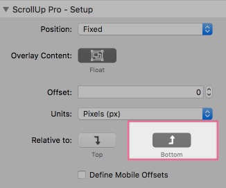
You can see a bottom fixed ScrollUp Pro that slides up and down on this page.
It is ideal for social links or other important information that you don't want to take up space on the page when users are scrolling downwards and reading the content.
Fixed Styles: Quick setup guide.
1. Setup Up Intital Styles
The main ScrollUp Pro stack settings sets the initial styles that you wish to apply when the stack first appears on the page.
These stay in effect until a Style Marker is encountered.
2. Define additional styles.
You can add as many additional styles as required by clicking the Add Style button at the bottom of the stack.
3. Place ScrollUp Markers on your page
Simply place a ScrollUp Marker where you want a color and style change to occur.
Enter a Style ID in the marker settings to control which of the additional defined styles (part 2) is displayed.
Choose to trigger when the marker reaches the top of the page or when it reached the bottom of the ScrollUp Pro stack.
4. Make detailed adjustments
To optimise the transitions, optionally define offsets in the marker stacks to enable pixel perfect control of when the are applied.
You can also define an offset in the main stack that applies to all markers.
Markers can be shared by multiple ScrollIUp Pro stacks. If a marker is called Style1 then each stack will apply its own Defined Style with the ID of Style1
Slide Up: Quick setup guide.
1. Enable the Slide function
In the main stack settings simply select a slide trigger type of either Scroll or Marker activated.
2. Chose the Effect
Select the type of animation you would like and the transition time for the show and hide.
Select the type of fallback animation for touch devices where the more complex variants are not supported.
3a. For Scroll Activated Transitions
Select the amount of scroll in each direction (down the page and back up the page) that you would like to trigger the slide out.
It is recommended that the Show sensitivity is relatively small (i.e. 100px) so that the menu easily comes back into view with just a small scroll back up the page
3a. For Marker Activated Transiitions
First, set the default state (either shown or hidden in the main stack settings).
Simply place a ScrollUp Marker where you want a slide change to occur.
In the simple case, just set the Slide Trigger state to Show or Hide in your existing Style Markers.
Make sure that you define the state for each of your markers.
For more advanced control you can use a ScrollUp Pro within another ScrollUp Pro to make hiding headers. See the "Medium Blog style" demo page.